
Stripping Out Friction: How Micro-Tasks Keep Users Coming Back

The Monday Morning Inbox
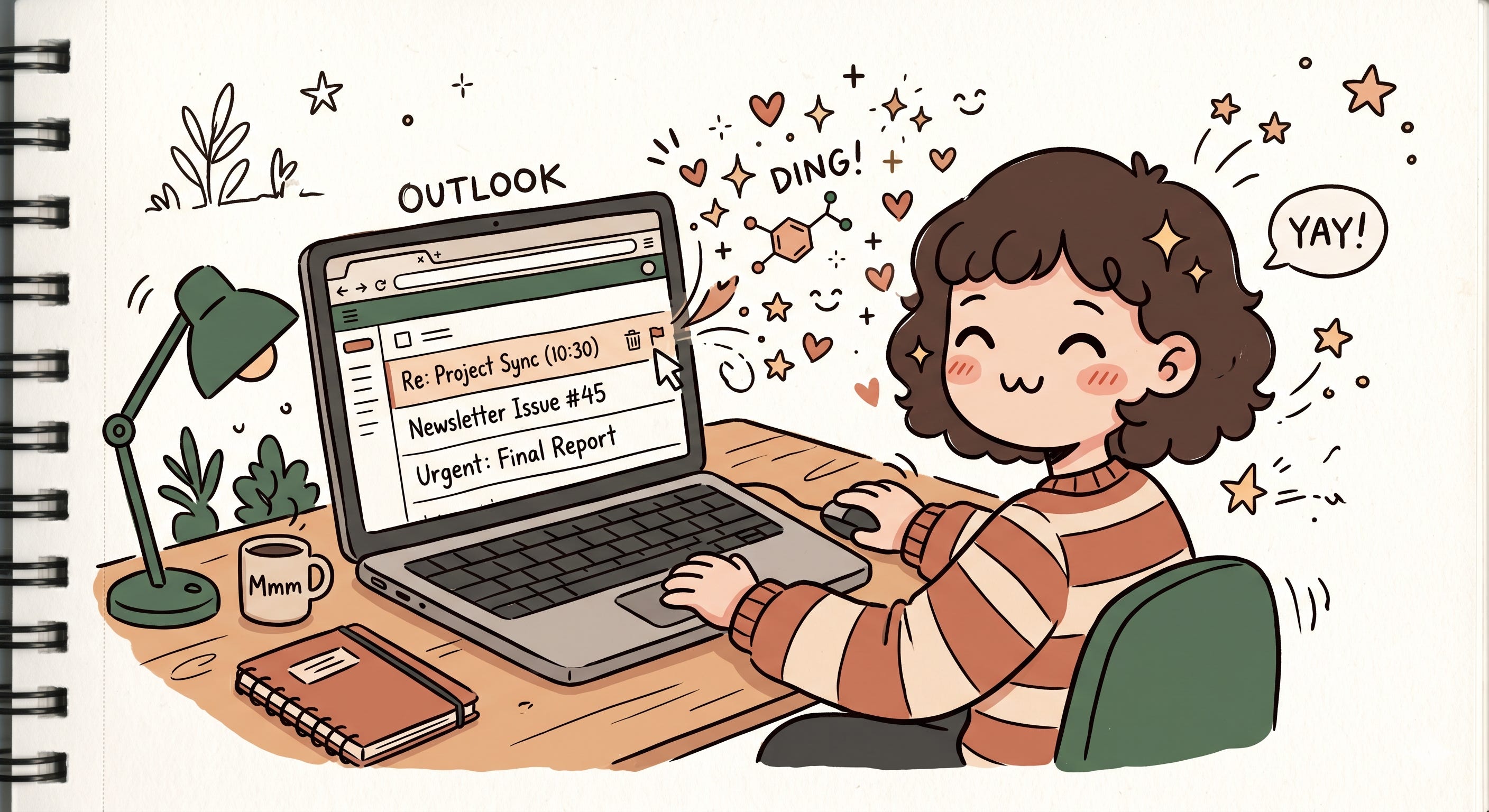
It’s Monday morning. You open Outlook with one simple goal: reply to a client email before your first meeting starts. But twenty minutes disappear instantly. You flag three threads, archive five newsletters, mark two emails as unread because they “feel important,” accept a meeting invite, and somehow completely forget the original email you opened the app for in the first place.
Oddly enough, though, it doesn’t feel exhausting. It feels productive. Almost satisfying. Like you’re clearing mental clutter faster than it can pile up. And somewhere in that repetitive loop of deleting, flagging, replying, and archiving, your brain starts getting tiny hits of relief.
But productivity software did not always feel this lightweight.
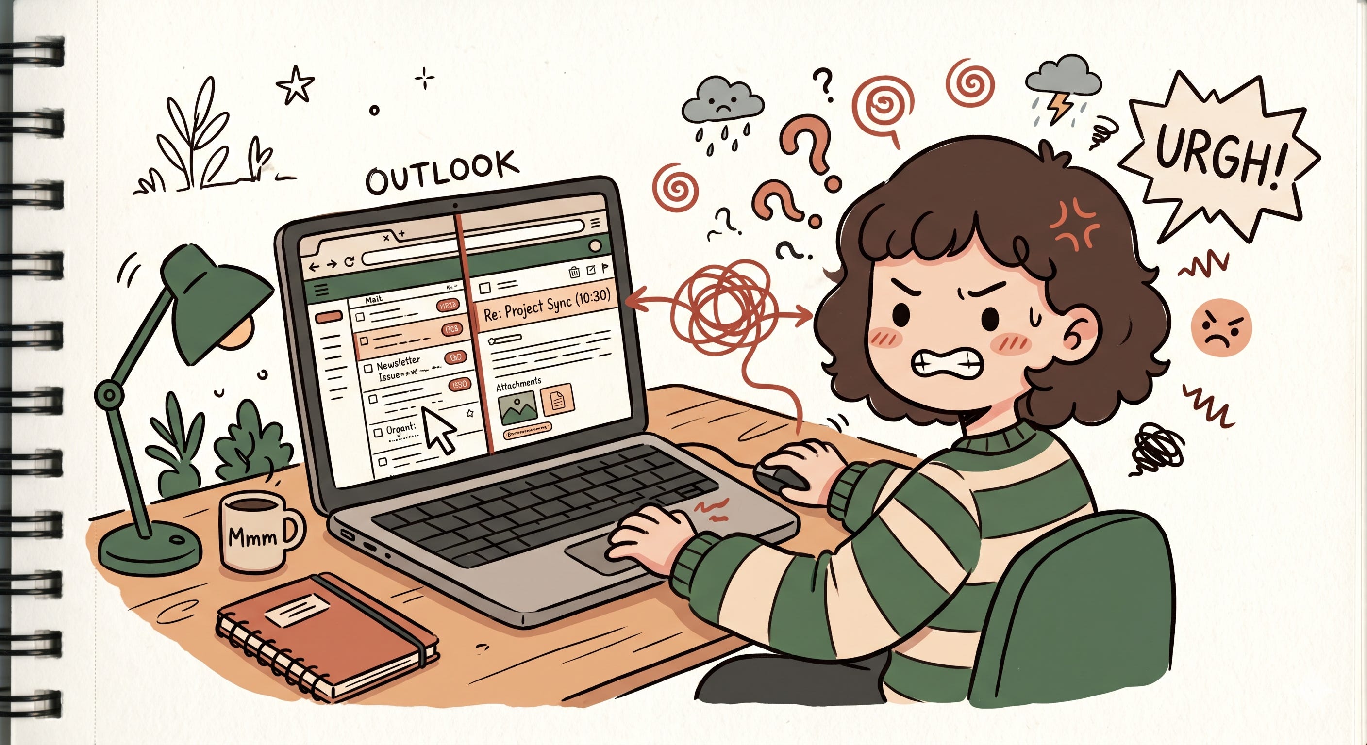
A few years ago, every email demanded commitment. You clicked into the mail. Waited for the detail pane. Moved your eyes away from the inbox. Searched for the action buttons. Performed the action. Returned back to the list. Then repeated that entire ritual again for the next email.
None of these steps were individually painful. But together, they created friction. Tiny interruptions. Tiny delays. Tiny moments where your brain had to constantly reset itself. And product teams quietly started realizing something uncomfortable: users were spending too much time navigating software instead of actually getting work done.
The Real Enemy Was Never The Email
You know what’s interesting? Most people think email fatigue comes from volume. Like, “Oh I have 120 unread emails, no wonder I’m tired.” But honestly, that’s only half the story.
The real exhaustion comes from context switching.
Every time you open an email, your brain shifts environments. You leave the inbox view, enter the detail view, process information, make a decision, then return back again. Do that a hundred times a day and your attention starts fragmenting into pieces.
And the scary part is that you don’t consciously notice it happening.
You just end your day feeling strangely drained despite not doing anything physically demanding. Your brain spent the entire day relocating itself. Reorienting itself. Reloading context again and again. That’s what cognitive load actually feels like in the real world. Not some textbook UX term, but that weird mental heaviness after hours of fragmented interactions.
And this is exactly where hover actions entered the picture.
If you’ve read so far, and such introspectives on UX, product strategies and product decisions matches your vibe. I would love for you to join my chat where I intent to share such product takes regularly and have interesting conversations from different perspectives.

The Philosophy Behind Hover Actions
When Outlook introduced quick actions on hover, it looked like such a tiny feature. Hover over an email and suddenly Delete, Flag, Archive, or Mark as Read appeared instantly beside the mail item.
At first glance, it feels like a small convenience improvement. But underneath it was a much bigger philosophy shift happening across software design.
The goal was no longer:
“Help users navigate software properly.”
The new goal became:
“Keep users moving.”
That’s a completely different mindset.
Instead of forcing users to enter a task before acting on it, the interface started bringing actions directly to wherever the user already was. You stopped “opening emails” and started triaging them. The inbox became less of a reading experience and more of a control surface.
And once users experienced that speed, there was no going back.
Why Tiny Actions Feel So Good
What fascinates me most is how these micro-tasks create such a strong psychological effect despite being so small.
Deleting one email is not an achievement. Neither is archiving a newsletter. But your brain doesn’t only reward major accomplishments. It rewards visible progress.
Every tiny completed interaction gives your brain closure.
Delete. Done ☑️
Archive. Done ☑️
Reply sent. Done ☑️
And suddenly your inbox starts feeling less intimidating. Less chaotic. More manageable. Modern productivity software has become incredibly good at manufacturing these tiny moments of completion because they create momentum.
And momentum is addictive.
That’s why clearing emails for twenty minutes can sometimes feel more emotionally satisfying than working on one large difficult task for two hours. One gives you constant visible progress. The other delays gratification.
Product teams understand this deeply now.
Why Productivity Apps Cannot Behave Like IKEA
There’s another interesting angle here.
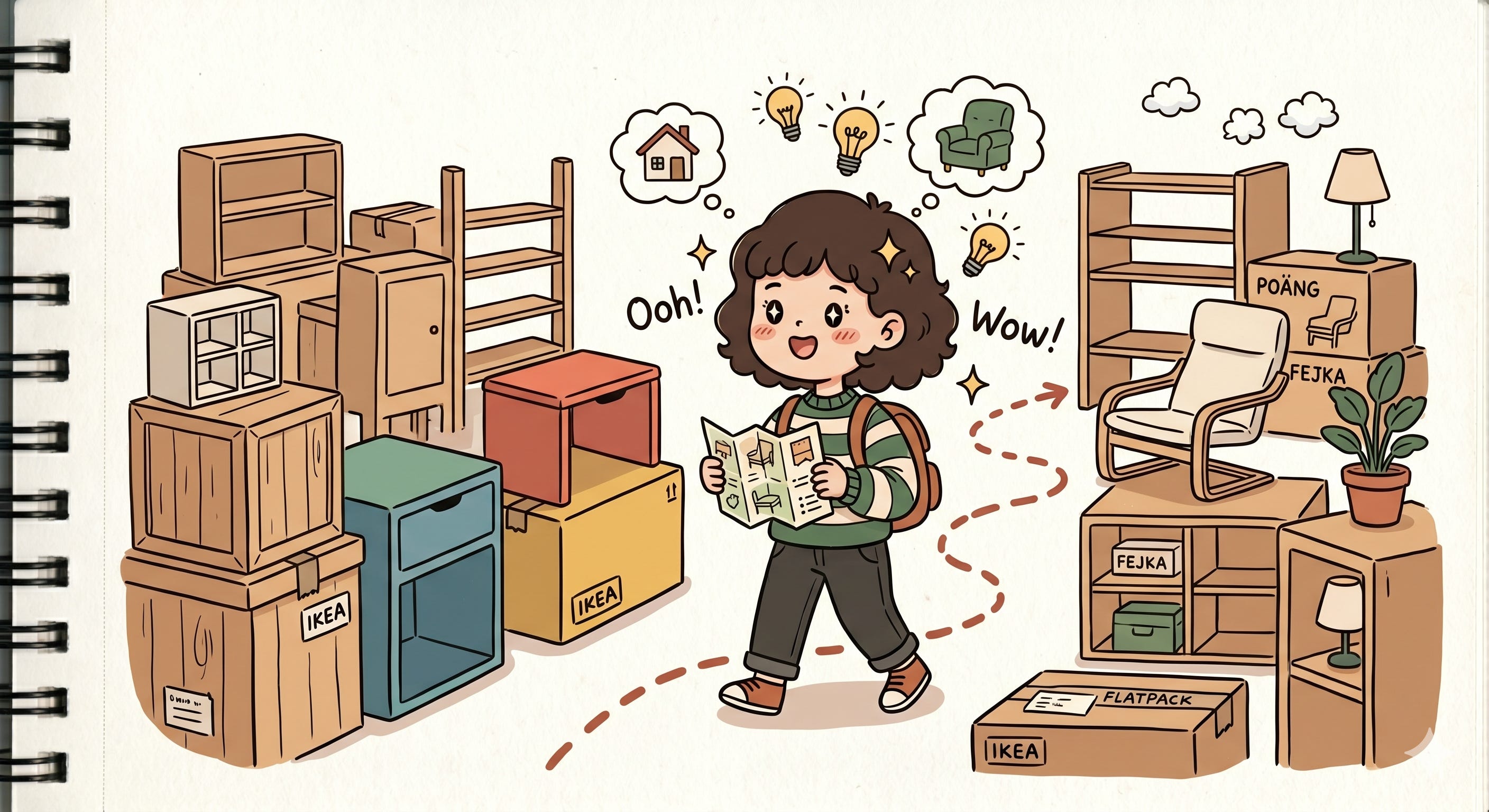
In physical stores like IKEA, people tolerate friction surprisingly well. You walk aisle by aisle through a giant maze just to buy one table lamp. Somehow it feels exploratory. Even enjoyable.
But imagine Outlook behaving like that.
Imagine clicking through multiple screens just to archive one email.
You would uninstall the app within a week.
And that’s because productivity software operates under a completely different psychological contract. The user is not here to explore. They are here to complete something quickly and leave. Every extra interaction feels like the software is disrespecting their time.
That’s why reducing clicks became almost a religion in product management circles.
Not because clicks are physically difficult.
But because every unnecessary interaction introduces hesitation, delay, and cognitive effort. In productivity tools, the shortest path usually wins.
AI Is Following The Exact Same Pattern
What’s funny is that we are now watching AI products repeat this exact same UX evolution all over again.
Take the “Ask ChatGPT” option that appears when you highlight text on some systems. Technically, it’s just a shortcut. But philosophically, it’s identical to Outlook’s hover actions.
Without it, the user has to:
copy the text, open ChatGPT, paste it, explain context, then ask the question.
That’s friction.
So modern AI products remove the journey entirely.
Highlight. Ask. Done.
Same pattern. Same philosophy. Reduce the distance between intention and action.
Even features like checkpoint restores in Copilot, queued questions, vertical conversation tabs, suggested prompts, inline rewrites, and one-click summaries are all solving the same invisible problem: protecting users from cognitive exhaustion.
And honestly, even the tiny “Copy” button beside AI outputs matters more than people realize.
Early AI tools without copy icons felt frustrating in such a weird way. Not because copying text is hard, but because manually selecting text interrupts your flow. Suddenly you stop thinking about your task and start thinking about mechanics.
The illusion breaks.
The Modern User Has No Patience Left
And maybe this was inevitable.
Today’s hardware is insanely fast. CPUs, GPUs, Apple Silicon, everything responds instantly. Which means human tolerance has changed alongside it.
Users no longer separate:
slow software
confusing software
friction-heavy software
To them, it all simply feels broken.
And in today’s software market, that’s dangerous.
Every category has become a red ocean. There are alternatives everywhere. If your product introduces friction, users don’t sit around hoping you improve it anymore. They switch. One annoying workflow is sometimes enough to push someone toward a competitor.
That’s why modern UX innovation often looks deceptively small.
Not dramatic redesigns.
Not flashy AI demos.
But tiny invisible interactions that quietly preserve momentum.
Because somewhere along the way, the software industry realized something important:
Users are not just chasing productivity anymore.
They are chasing flow.